Designing for wellbeing – reframing colour in schools
15 July 2025
Designing a new school is a balance of practical requirements, regulatory standards, and the desire to create spaces that feel uplifting, inclusive, and lasting.
Our recent work with Monmouthshire County Council designing the new King Henry VIII 3–19 through school in Abergavenny presented a valuable opportunity to look closely at how colour contributes to that balance.
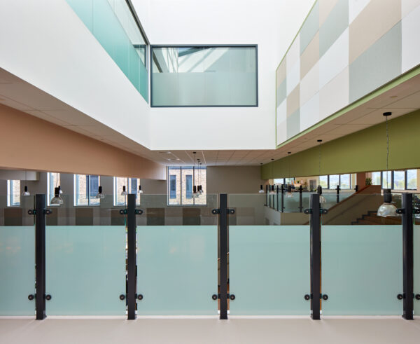
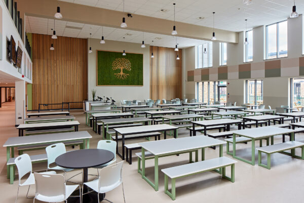
From the start, inspired by the landscape surrounding the school, we aimed to bring a sense of calm and connection indoors. With nature in mind, we adopted a biophilic approach, not only in layout and materiality but also in the colour strategy.
Achieving compliance with Light Reflectance Values (LRVs) can be one of the key challenges in any public building, particularly in education. These values are used to support accessibility and ensure enough contrast between surfaces like walls, floors, and doors, and traditionally result in high-contrast palettes, like white walls, dark floors, and often primary colours used for accents.
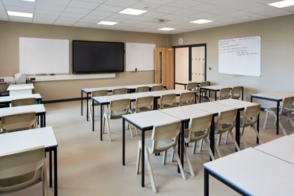
From a compliance perspective, these schemes, while effective, can sometimes feel harsh or overly stimulating for neurodiverse students who may experience sensory overload, so we explored an alternative. One that meets regulatory requirements and aligns closely with the calming, muted tones of the landscape surrounding the school.
Through studying and researching over 100 colours, we developed a new process. We catalogued the colours by tone and LRV and tested how they performed together under different lighting conditions. Rather than limiting colour choice to a few bold accents, we introduced a broader tonal palette. By working closely with Building Control, we demonstrated that in well-lit areas, a slightly lower contrast threshold could still support visibility and safety. We also revisited assumptions, like skirtings needing to match walls or floors, proposing small but effective shifts that improved visual clarity without disrupting the overall scheme.
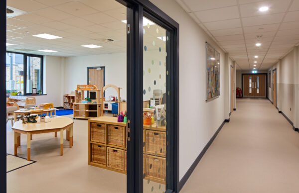
The result is a colour strategy that works equally well across the Lower and Upper Schools. It provides enough vibrancy for younger pupils while offering a mature, cohesive environment for older students, not only helping to ease the transition between spaces and age groups but improving the wayfinding experience for all.
This approach doesn’t reinvent the rules, it reconsiders how we apply them. The materials and standards aren’t new. What changed is the willingness to question established rules and regulations in favour of something more thoughtful, inclusive, and context-driven.
